What do people die from in different countries?
An interactive tool to explore causes of death by age, gender, and time, across the world.
On any average day, 165,000 people die globally. That’s 60 million a year. What do they die from?
To answer this, my colleagues Sophia Mersmann and Fiona Spooner built an interactive visualization of causes of death across the world.1 In this article, I'll give a few snapshots of how this compares across countries at different income levels.
But the real power is in exploring the tool for yourself — you can do that for your own country at the end of this page.
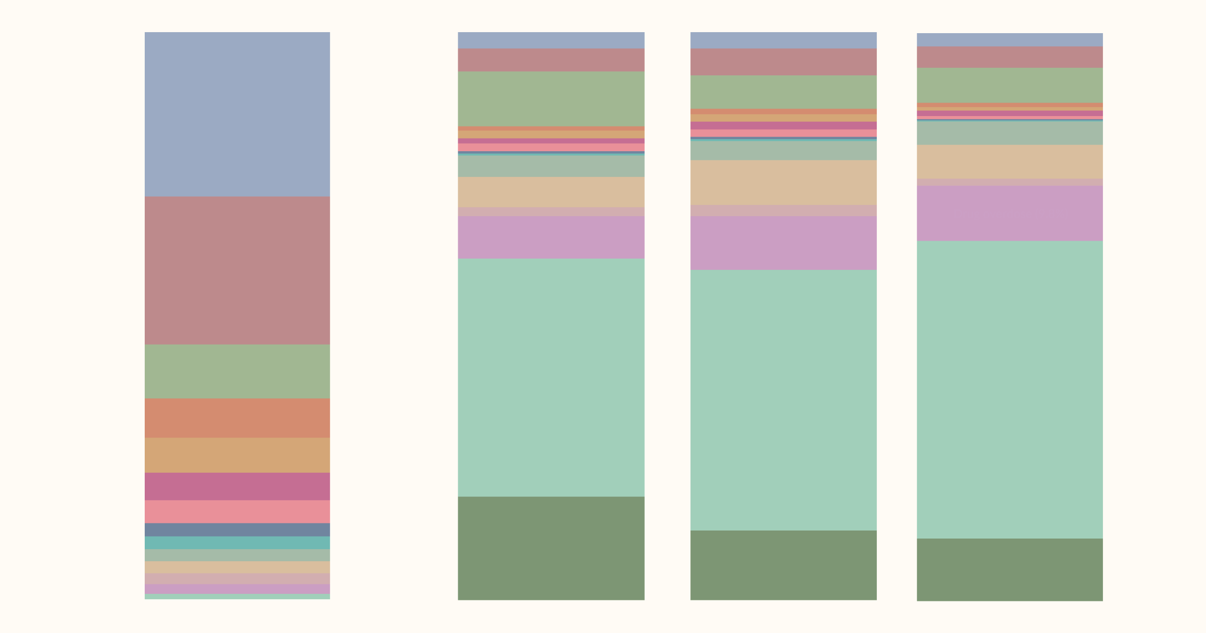
Below, you can see the causes of death for the world as a whole. The total size of the visualization represents the entire 60 million global deaths, and the size of each rectangle — each one a different cause of death — is proportional to its share of the total. (This is called a treemap.)
Three-quarters of global deaths were caused by non-communicable diseases (NCDs), which are shown in blue. Heart disease alone accounts for one in three deaths. Cancers are almost one in five.
In red, you see that 14% died from infectious diseases, led by respiratory infections like pneumonia, the flu, and COVID-19. But malaria, diarrheal diseases, tuberculosis, and HIV still claim millions of lives, despite the fact that the world already knows how to prevent and treat them.
In green, you see that 7% died from injuries: road accidents, drowning, falls, suicide, and violence. And in purple, you see that almost 4% of deaths were among babies and mothers — a tragedy that we'll return to.
This is what this treemap is useful for: putting things into perspective. In the bottom-right corner, you can see that 2.7% of all deaths are among newborn babies. That’s around four times higher than all homicides, which are shown just above it in the green box.
How do causes of death differ between poorer and richer countries?
The leading causes of death look very different across the world.
The following chart shows the estimates for low-income countries.
As you can see, non-communicable diseases account for 43% of deaths; that’s a much smaller share than in the world as a whole (75%). That’s not because death rates of these diseases are lower in poorer countries; adjusting for age, they’re actually higher than they are in rich countries.
The difference is that death rates from infections, injuries, and child and maternal mortality are far higher. One in three die from infectious diseases such as HIV/AIDS, malaria, meningitis, and tuberculosis.
Maybe the hardest number in this dataset to sit with is that one in ten deaths is a newborn or a mother leaving children behind.
On the other end of the income distribution, we see a very different picture.
Infectious diseases and neonatal and maternal deaths shrink, while non-communicable diseases are very dominant. They cause almost 90% of deaths, with heart diseases and cancers alone responsible for almost 60%.
Explore what people die from in your own country
The treemap below is the full, interactive version of this visualization. My colleagues Sophia and Fiona spent several months building it using data from the Institute for Health Metrics and Evaluation’s Global Burden of Disease.
It covers every country in the world and spans more than four decades of data.
You can select your own, or any other country, switch between years to see how things have changed over time, and look at a specific age group or sex. The picture can be very different depending on where and when you look.
Acknowledgments
Many thanks to Max Roser and Edouard Mathieu for feedback and suggestions on this article, to Tuna Acisu for data assistance, and Daniel Bachler for editorial support on the visualization.
Endnotes
All of the data used in this visualization comes from the IHME’s Global Burden of Disease study.
Global Burden of Disease Collaborative Network. Global Burden of Disease Study 2023 (GBD 2023). Seattle, United States: Institute for Health Metrics and Evaluation (IHME), 2025.
Cite this work
Our articles and data visualizations rely on work from many different people and organizations. When citing this article, please also cite the underlying data sources. This article can be cited as:
Hannah Ritchie, Sophia Mersmann, and Fiona Spooner (2026) - “What do people die from in different countries?” Published online at OurWorldinData.org. Retrieved from: 'https://archive.ourworldindata.org/20260413-000143/what-do-people-die-from-in-different-countries.html' [Online Resource] (archived on April 13, 2026).BibTeX citation
@article{owid-what-do-people-die-from-in-different-countries,
    author = {Hannah Ritchie and Sophia Mersmann and Fiona Spooner},
    title = {What do people die from in different countries?},
    journal = {Our World in Data},
    year = {2026},
    note = {https://archive.ourworldindata.org/20260413-000143/what-do-people-die-from-in-different-countries.html}
}
Reuse this work freely
All visualizations, data, and code produced by Our World in Data are completely open access under the Creative Commons BY license. You have the permission to use, distribute, and reproduce these in any medium, provided the source and authors are credited.
The data produced by third parties and made available by Our World in Data is subject to the license terms from the original third-party authors. We will always indicate the original source of the data in our documentation, so you should always check the license of any such third-party data before use and redistribution.
All of our charts can be embedded in any site.